Updates to Lava site
Im going to carry on improving the 'Lava' website. Not for the client project, as the deadline's passed, but for my portfolio.
Ive uploaded the site to the net on my own domain for a limited time. (http://www.greensky-creations.co.uk)
Ive added minimum height and width so it no longer scales to infinity! Ive also changed some of the margins/padding values to balance the design better.
Thursday, April 24, 2008
Monday, April 21, 2008
Wednesday, April 16, 2008


Thursday, April 10, 2008


Tuesday, April 08, 2008
Software Tutorials
Just a quick post to make a note of a couple of good tutorials seen today for future reference.
Just a quick post to make a note of a couple of good tutorials seen today for future reference.
- http://www.lynda.com/ - Learn Flash and other software tutorials.
- http://www.timsilva.com/ - Flash button tutorial and other nice bonus layout effects.
- http://www.9tutorials.com - Photoshop, Flash & Illustrator tutorials.
- http://www.tutorial9.net/ - Photoshop effects

Monday, March 17, 2008
PRP Artefact Evaluations 1 + 2
Here are my submittions for the evaluations of Artefacts 1 and 2 of my Personal Research project. Ive not only uploaded them up on here for my own personal log, but also because when submitting them via the university network i was unable to submit images.
My research project question I am investigating is “What design elements most influence users when determine the function of web pages”
For this research I have created six web page layout designs as artefacts. Each artefact represents a different genre of websites. Users answer a questionaire, stating what genre of website they think the web page is of and how much the design elements influenced their decision. The design elements used reflect my research into websites of each genre. I hope to discover whether users use these elements to distinguish the function of the site without need for content.
Artefact 1 - Gaming community web page.
 The gaming design took 3-4 hours to create in Photoshop CS2. The colour scheme and layout is typical of web pages in the gaming community websites genre. I re-designed the artefact twice as I wasn’t happy with the design - the design above was the third attempt at this artefact - and so the only problem I encountered was that it took longer than anticipated to complete.
The following graph displays the results of question one of the questionaire. Out of 20 people surveyed, 85% correctly thought the artefact was designed to be a gaming community site.
The design elements which most influenced these answers were the Colour Scheme, Page Layout, Banner Size and Navigation – as indicated below.
 60% of people surveyed thought the primary function of the web page design was for user interaction (communication).
In conclusion, the survey results suggest that the artefact’s design element are mostly in favour of the overall look and feel of the design, rather than specific elements.
Artefact 2 – Portfolio
 The portfolio design took 2-3 hours to create in Photoshop CS2. The content position and lighting effects are similar to that of online portfolio web pages that I have seen. I didn’t have any problems while creating the artefact, although I did remove the original banner as I felt it detracted from the design theme.
The following graph displays the results of question one of the questionaire. 80% of people surveyed correctly thought the artefact was designed to be an Online portfolio website.
10% thought it was a car showroom and the other 10% thought it was a gaming community web page.
The design elements which most influenced these answers were the Page Layout, Content Design and possition – as indicated below.
 75% of people surveyed thought the primary function of the web page design was for advertising (drawing public attention to).
In conclusion the results of the survey suggest that the artefact’s design elements are most in flavor of content design and content position.
The next two Artefacts will be completed and uploaded after the submittion of my Client 'Live' Project, which is due in 14th April.
Here are my submittions for the evaluations of Artefacts 1 and 2 of my Personal Research project. Ive not only uploaded them up on here for my own personal log, but also because when submitting them via the university network i was unable to submit images.
PRP – Artefact 1 Evaluation Robert Hammerton N0096263
My research project question I am investigating is “What design elements most influence users when determine the function of web pages”
For this research I have created six web page layout designs as artefacts. Each artefact represents a different genre of websites. Users answer a questionaire, stating what genre of website they think the web page is of and how much the design elements influenced their decision. The design elements used reflect my research into websites of each genre. I hope to discover whether users use these elements to distinguish the function of the site without need for content.
Artefact 1 - Gaming community web page.
 The gaming design took 3-4 hours to create in Photoshop CS2. The colour scheme and layout is typical of web pages in the gaming community websites genre. I re-designed the artefact twice as I wasn’t happy with the design - the design above was the third attempt at this artefact - and so the only problem I encountered was that it took longer than anticipated to complete.
The following graph displays the results of question one of the questionaire. Out of 20 people surveyed, 85% correctly thought the artefact was designed to be a gaming community site.

The design elements which most influenced these answers were the Colour Scheme, Page Layout, Banner Size and Navigation – as indicated below.

 60% of people surveyed thought the primary function of the web page design was for user interaction (communication).
In conclusion, the survey results suggest that the artefact’s design element are mostly in favour of the overall look and feel of the design, rather than specific elements.
Artefact 2 – Portfolio
 The portfolio design took 2-3 hours to create in Photoshop CS2. The content position and lighting effects are similar to that of online portfolio web pages that I have seen. I didn’t have any problems while creating the artefact, although I did remove the original banner as I felt it detracted from the design theme.
The following graph displays the results of question one of the questionaire. 80% of people surveyed correctly thought the artefact was designed to be an Online portfolio website.
10% thought it was a car showroom and the other 10% thought it was a gaming community web page.

The design elements which most influenced these answers were the Page Layout, Content Design and possition – as indicated below.

 75% of people surveyed thought the primary function of the web page design was for advertising (drawing public attention to).
In conclusion the results of the survey suggest that the artefact’s design elements are most in flavor of content design and content position.
The next two Artefacts will be completed and uploaded after the submittion of my Client 'Live' Project, which is due in 14th April.
Thursday, February 28, 2008


Wednesday, February 27, 2008

Monday, February 25, 2008
PRP
First draft of gaming community design. The box background colours where the content will go need to be darker i think, but it looks ok for now. Ive started the blog design, which should be finished tomorrow. Also the questionaire relating to the six artifacts will be drafted tomorrow and then created using 'Autoform' on the VLP.
- Dimensions: 1024 x 768
- Type: JPEG
- Size: 209 KB
- Original Type: PDA
- Original size: 3.41 MB
First draft of gaming community design. The box background colours where the content will go need to be darker i think, but it looks ok for now. Ive started the blog design, which should be finished tomorrow. Also the questionaire relating to the six artifacts will be drafted tomorrow and then created using 'Autoform' on the VLP.

- Dimensions: 1024 x 768
- Type: JPEG
- Size: 209 KB
- Original Type: PDA
- Original size: 3.41 MB
Thursday, February 21, 2008


Tuesday, February 19, 2008


Monday, February 18, 2008
SPP3
An SPP task this week was to research and review relevant practitioners or work.
I found this practitioner called 'pixel3' through diviantart.com - http://pixel3.deviantart.com/
 He's a young web designer from kansas < usa. This image is a banner from one of his designs. I like the reflective effects used on the banner and the sides of the page. He uses these effect alot throughout his work, creating attractive designs and giving his work an identity.It have used this reflective style when creating the following, which i may use as a banner for my portfolio.

An SPP task this week was to research and review relevant practitioners or work.
I found this practitioner called 'pixel3' through diviantart.com - http://pixel3.deviantart.com/

Tuesday, February 12, 2008
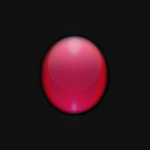
Live Project - Oh Shiny! 2
Here's an update to the last post. Ive decided to use the following image as the background for some text elements on the website.
 Ive added a box and some effects from a tutorial from http://www.tutorial9.net/ - theres a couple of effects ive not been able to muster. Im lagging due to tiredness, ya see. But I'll have anyother go at it tomorrow after Ive done some PRP work (you'll be happy to hear, Shaun!)
It's supposed to look like the windows on Microsoft Vista OS and it kinda does. - This is my first draft, as it were, so I expect an update or two.
Here's an update to the last post. Ive decided to use the following image as the background for some text elements on the website.
Ive added a box and some effects from a tutorial from http://www.tutorial9.net/ - theres a couple of effects ive not been able to muster. Im lagging due to tiredness, ya see. But I'll have anyother go at it tomorrow after Ive done some PRP work (you'll be happy to hear, Shaun!)It's supposed to look like the windows on Microsoft Vista OS and it kinda does. - This is my first draft, as it were, so I expect an update or two.

Live Project - Oh shiny!
For the last week Ive been playing around with css - looking at other people's code on zengarden (www.csszengarden.com/) and figuring out the elements i will require. Ive recently discovered *to my relief* how to position elements - this may sound basic but every tutorial out there on css (that ive seen) deals with the very-basics and, ofcourse, websites that use css, on the web have seperate stylesheets which arn't visable in the source. Ive been searching for this answer for ages and am so pleased ive found it.
So, for the passed week Ive been staring at code alot and im pretty sick of it! So I thought id work on the design side of the site for abit.
Im currently working on the windows that will hold the main text. Ive found some good tutorials about making graphics look reflective and transparent, and Im using these while playing around in photoshop - (http://www.tutorial9.net/)
The following is some examples of what iv been working on. These would be used as the backgrounds of windows:


Thursday, January 24, 2008
PRP - 1st Artifact

Say a person with protanopia colour blindness viewed a red object. The shade of the object would appear different to them than to us. However they still associate the shade they see with as ‘red’. Everytime they see that shade, its red to them.
There are general rules in web design about the colour combinations not to display. Many people are colour blind and would not be able to see red or green text on a brown background. However, what if these colour combinations were desired by a designer, to fit in with a brand for instance?
For my first artifact, I have designed a page so that people with normal vision and people suffering from Protanopia, Deutanopia, and Tritanopia colour blindness can all view the same page and still read the text.
The page works using links for each specific colour blindness. When clicked the background and text colours of the problem section are changed to give the best contrast for the user’s vision.
Colour options for websites exist, but with multiple filters on a website, or even browsers - changing the colours to provide better contrast - would enable a better user-experience and company-user interaction for the majority of people suffering from colour blindness using the web.
Sreenshots displayed below:

Tuesday, January 15, 2008
Research Project - 1st Artifact
I have found a colourblind filter tool which shows you websites through the "eyes" of people with specific types of colour blindness. http://colorfilter.wickline.org/
I will use this tool and apply it to webpages for the first artifact, rather than creating my own page. This will not just save me time, but allow the artifact audience to view many recognizable webpages under the position of someone with colour blindness.
This will help to show different sized company's approach to their whole audience.
Subscribe to:
Posts (Atom)